BRAND IDENTITY
Alora Brand Guide
The name, logo, colors, typography and usage principles of Alora (아로아). Download the files below whenever you need the logo.
Name
Written Alora in English and 아로아 in Korean. The wordmark uses lowercase alora.
In running text, write “Alora” — never all caps (ALORA).
Symbol

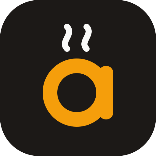
A lowercase a — the first letter of Alora — drawn simply with a round bowl and a vertical stem.
The two rising wisps stand for freshly made warmth: things made with care that feel comfortable to reach for every day.
The dark rounded square keeps the mark crisp anywhere, just like an app icon.
Logo
Horizontal · Light
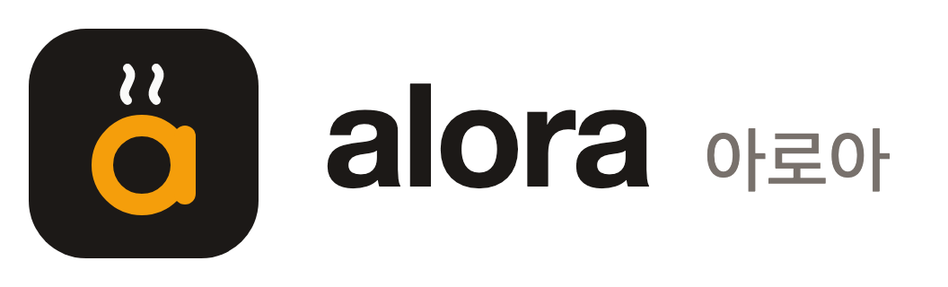
Primary logo for white or light backgrounds.
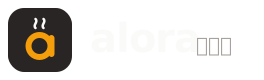
Horizontal · Dark
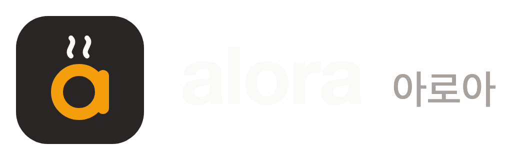
For dark backgrounds or over photography.
Symbol
For tight spaces: favicons, app icons, profile images.
Color
#1C1917
RGB 28 25 23
Primary text, symbol background
#F59E0B
RGB 245 158 11
Accent — use sparingly for emphasis
#FAFAF9
RGB 250 250 249
Primary background
#78716C
RGB 120 113 108
Secondary text
Typography
Pretendard for both Korean and Latin text. Headings use ExtraBold (800) to Black (900); body text uses Regular (400) to Medium (500).
alora 아로아
Taking our time to get it right.
Pretendard · ABCDEFGHIJKLMNOPQRSTUVWXYZ · 가나다라마바사 · 0123456789
Usage
Clear space
Keep empty space of at least 1/4 of the symbol height around the logo.
Minimum size
On screen, don’t go below 24px for the symbol or 24px tall for the horizontal logo.
Don’t
Stretch or squash, rotate, recolor, add shadows or outlines, or place directly on busy photos.
Downloads
Use SVG for web and print (scales without loss), PNG for documents and messengers.